|
|
Post by FF Admin on Sept 4, 2016 20:07:15 GMT -6
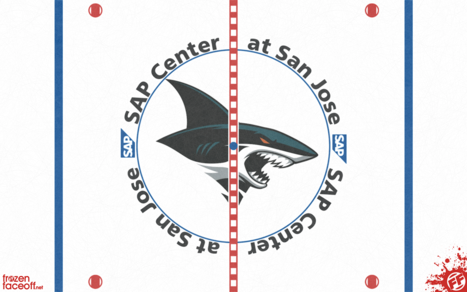
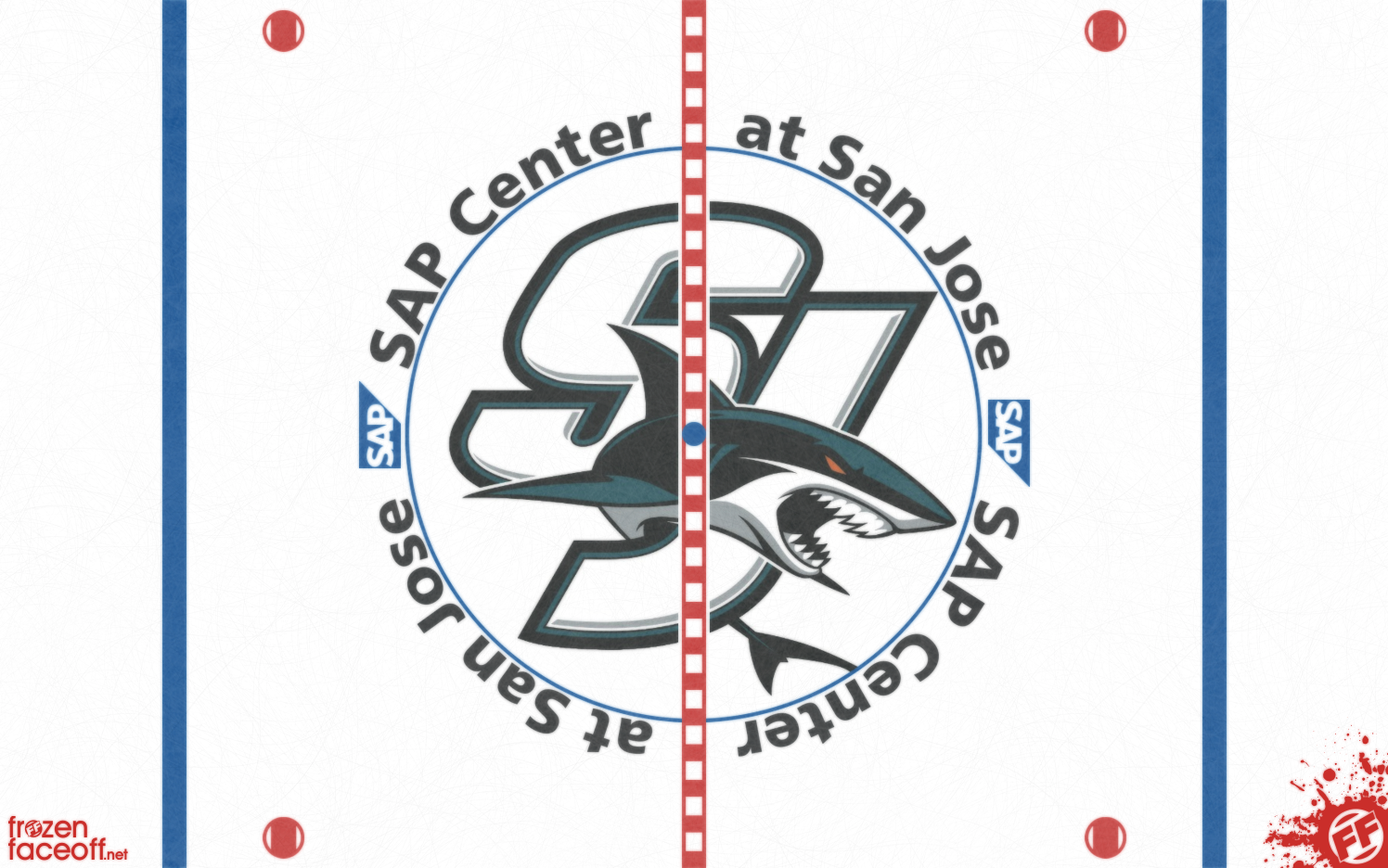
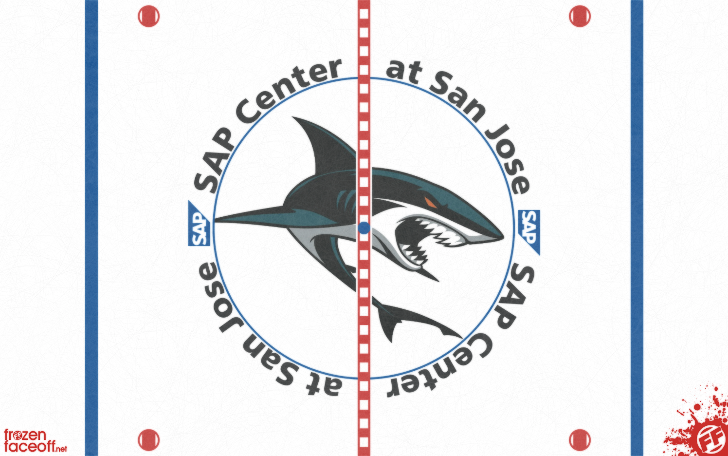
Note: Please sign up for free proboards account and you can get in on this poll and future ones as well as many other discussions around the forum. Thanks! -Frozen Faceoff Current Logo:  Option 1:  Option 2:  Option 3:  |
|
|
|
Post by sharksfan8 on Sept 4, 2016 22:40:21 GMT -6
Option 1. But I would love to see a fin pattern along the red line.
|
|
|
|
Post by SprungGolem5 on Sept 5, 2016 17:20:18 GMT -6
I like all of them, except Option 1.
|
|
|
|
Post by mattszuucc on Sept 5, 2016 18:05:54 GMT -6
I would go with the design used previously in the 2014-15 season. It is most suitable as San Jose's new secondary logos do not really have much connection with the very first 1991-2007 logo, which that and the current (2007-present) logos have a shark crushing a hockey stick.
|
|
|
|
Post by iluvphantoms on Oct 15, 2016 9:13:16 GMT -6
I would chose either 1 or 3
|
|
|
|
Post by Ricky Mazella on Jan 26, 2017 10:15:55 GMT -6
2 for me
|
|
|
|
Post by 3aplus63poill on Apr 10, 2020 4:14:54 GMT -6
<b></b>
|
|